 (Credits: Design 365: January 31 Day Page Templates By Spencer Nugent, Design 365: January Pack By Spencer Nugent, ESSENTIALS-Stitches v.1 By Carina Gardner, The Day Dreams Collection - Sunset Elements By Meredith Fenwick)
This week my Project 365 photo subject was winter. Shooting photos in the winter can be a tricky thing. I found that the bright snow causes my camera to underexpose my photo. The snow often took on a hue of gray. I will be doing some more study of adjusting my white balance on my camera before I head out to the snow to shoot photos again. Here is just one tutorial I found on this subject:
Understanding White Balance.
These two articles give encouragement to get out and shoot some winter photos. I know I often prefer to do outdoor photography in the other three seasons of the year and tend to stay in the house more in the winter. There are plenty of things to photograph indoors where it is warm but I find that after a little reading and looking around on the net I may just get out and try some new things with my photography this winter.
The Beauty of Winter Photography
Dreaming Winter Photography
Now what about those photos that I was mentioning earlier.... the ones where the snow took on a gray color cast. Well... that is when I am happy to have photoshop. I am still and probably always will be in the learning phase about what this program can do.
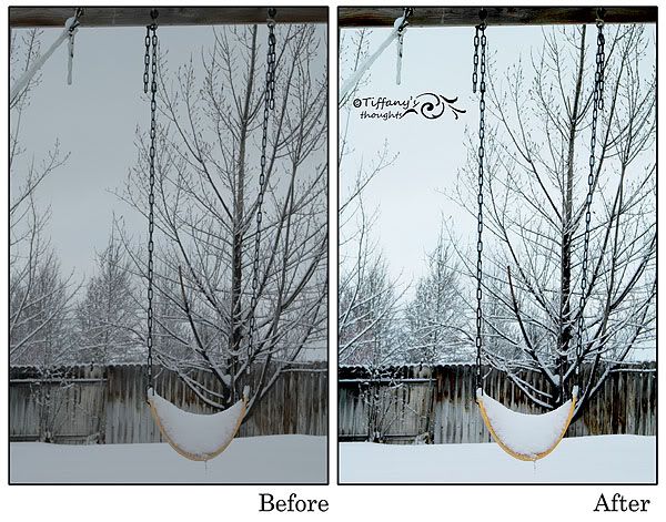
The first thing I did was added a Brightness/Contrast adjustment layer. I adjusted my brightness by 30 and set my contrast to 75. When making these adjustments it is a personal preference thing. You have to decide how far to go. If you expose the photo too much you can easily blow out detail. Sometimes I don't mind loosing a little detail if the overall look of the image is improved.
Brightness - How light or dark the picture is.
Contrast - How the brightness is distributed from the lightest to darkest parts of the picture.
Next I added an Exposure adjustment layer. I adjusted my exposure to +10, my offset to -0.0183 and my gama to 1.12 Again this is a to personal taste adjustment.
Exposure – lightens/darkens image.
Offset – adjusts shadow/highlight areas.
Gama – adjusts contrast.
Finally I added a Hue/Saturation adjustment layer where the only adjustment that I made was on the saturation slider which I increased by +25.
Hue - the color.
Saturation - how vivid the color is.
Lightness – how dark/light the color is.
If you want a more in depth look at these photoshop adjustments you can see the tutorial Fixing Exposure and Brightness. Although they don't use adjustment layers. They make the changes directly to the image. I prefer to work with layers so that I have the ability to go back into any of these adjustments and further tweak them as I go along. Using layers is what they call "non destructive photo editing." If you choose to work directly on your photo just be sure to never overwrite the original photo but save the edited photo under a different name. You never know when you may change your mind about the way you edited or your photo or when you may learn a new/better way of editing and want to try it again.
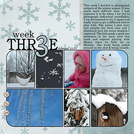
Of course how you choose to crop your photo can improve the impact of the photo as well. I like the closer crop of this photo in my Week 3 layout above better than looking at the entire image. To me there is just too much negative space in the upper left hand corner. OK... that is a wrap for me. I can't believe how much time it takes to put something like this together. Makes me appreciate all the great tutorials out there on the net even more. Have a great weekend!


No comments:
Post a Comment